Rebrand for a construction company
The approach to the rebrand of this construction company was to market them as high-end with an architectural energy.
Rebrand for a construction company
The approach to the rebrand of this construction company was to market them as high-end with an architectural energy.
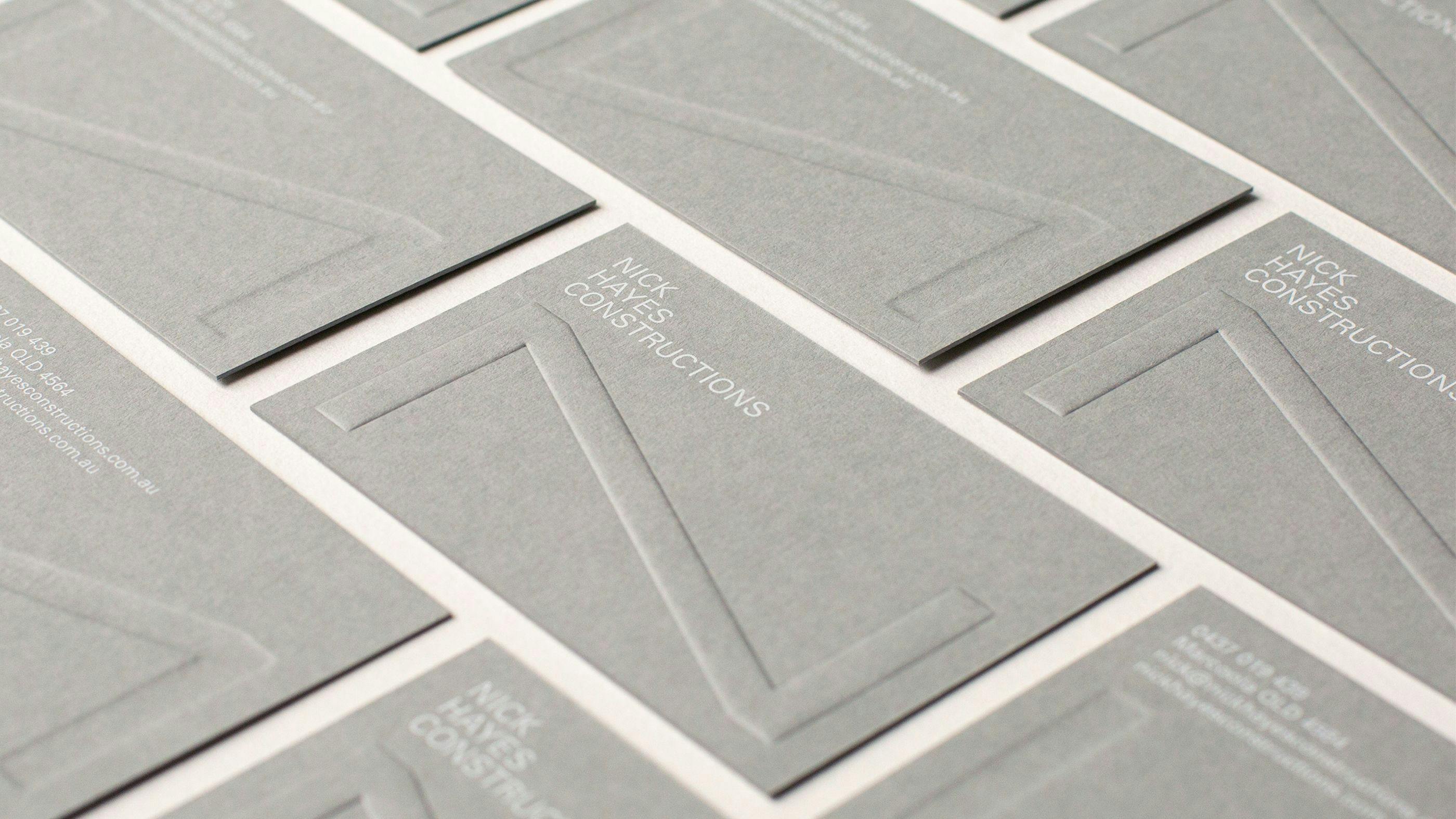
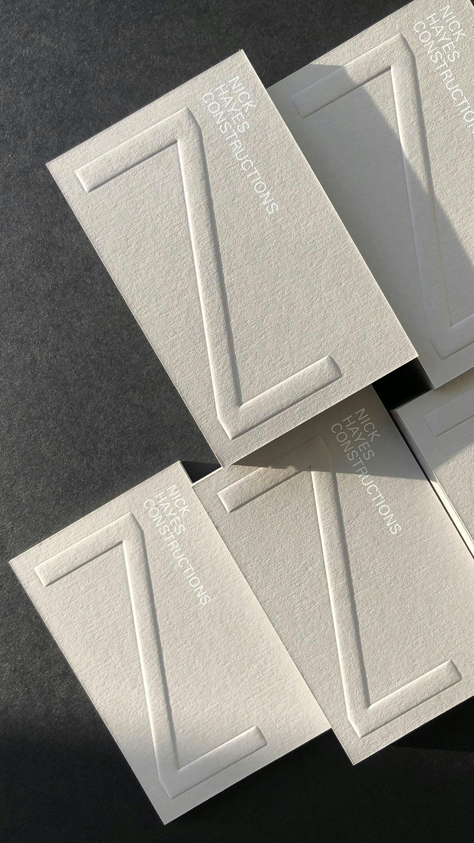
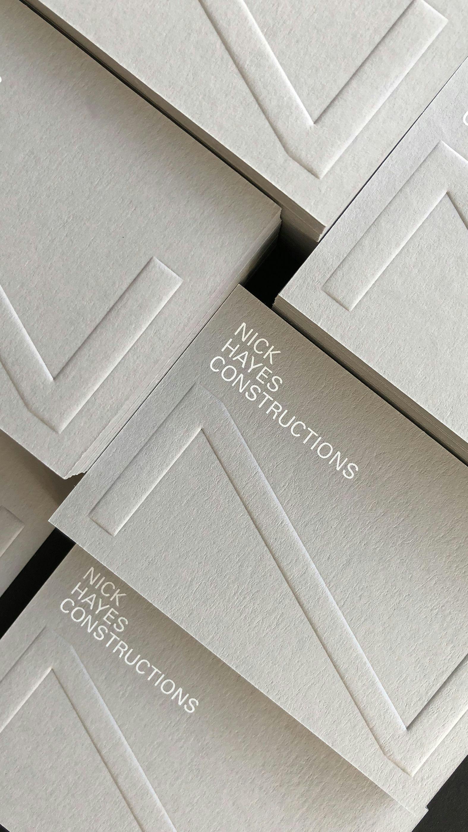
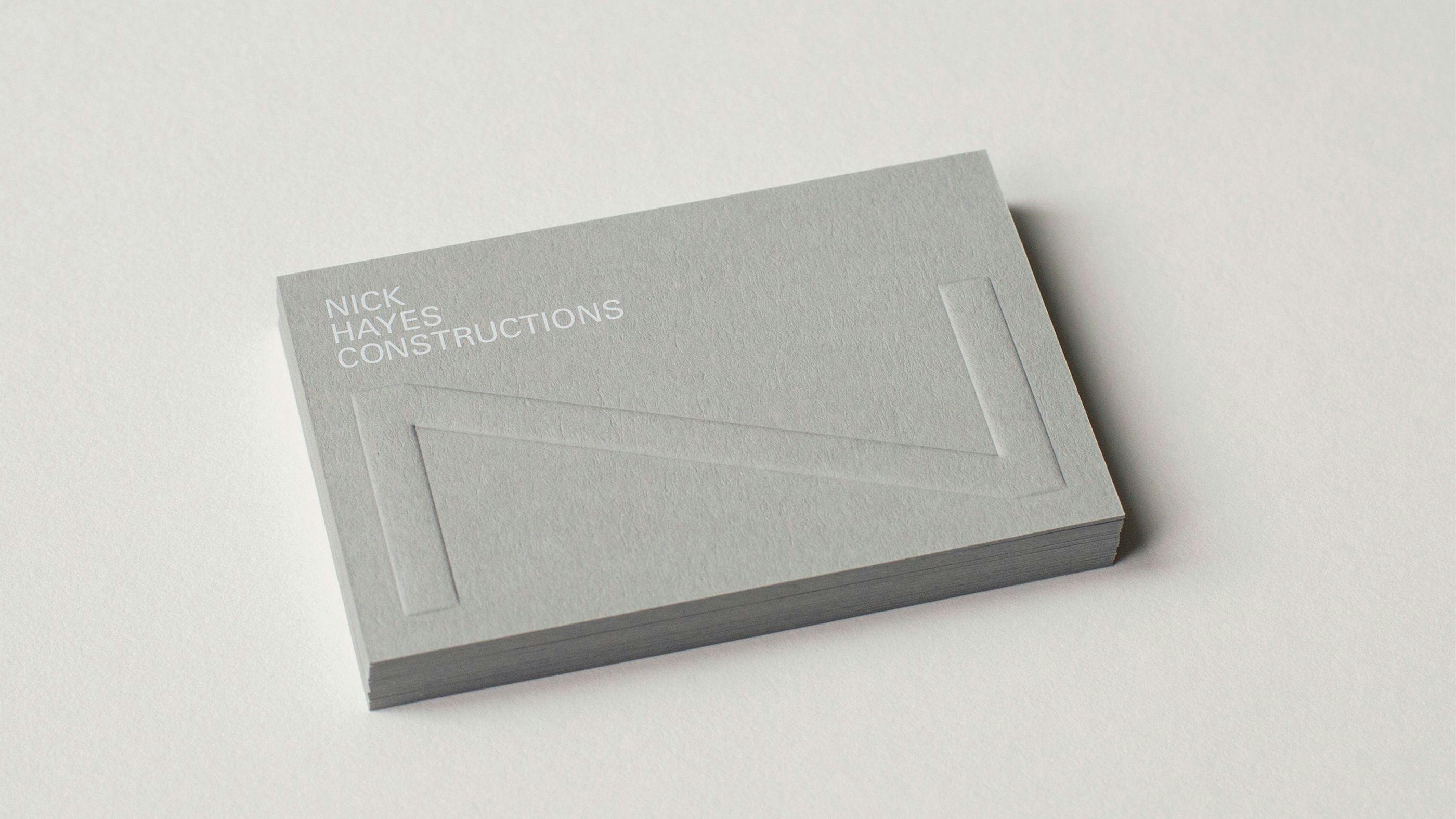
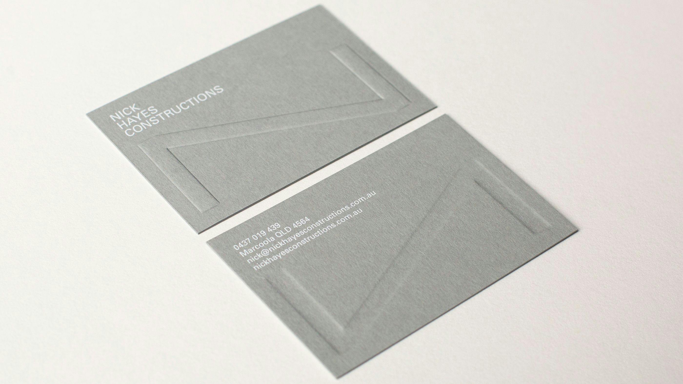
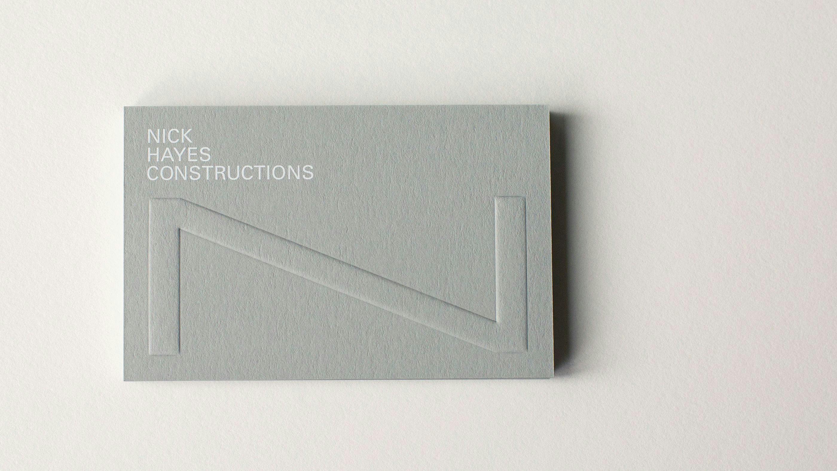
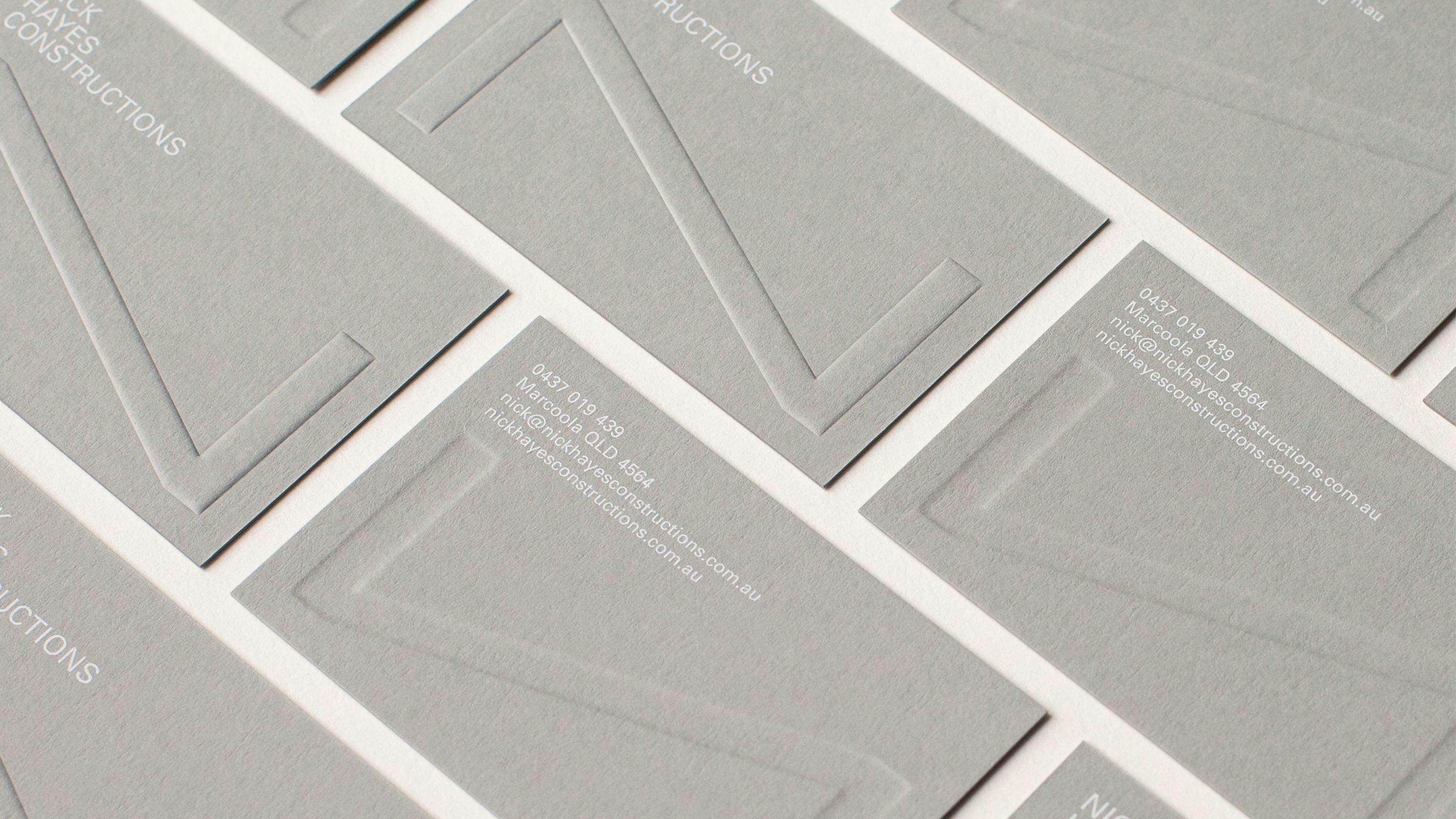
With a portfolio showcasing beams as strong linear formations and consisting of architectural elevations, these were used as inspiration for the creation of the new logo design. An obscure yet intriguing identity, it’s one that represents Nick Hayes as being unique. The design now speaks to an affluent and niche audience while representing the quality of their work – attentive to details.
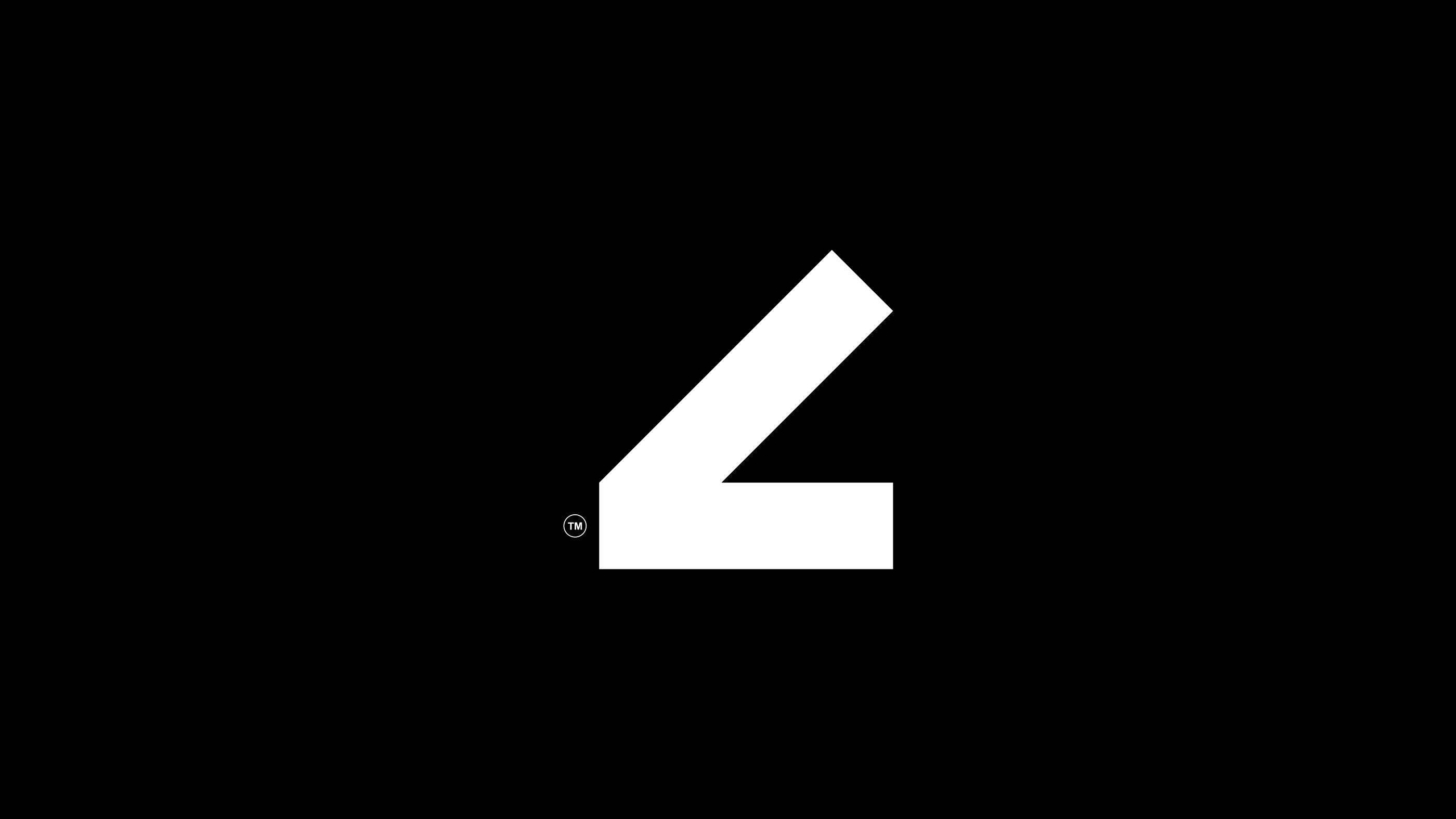
The icon is a monogram of sorts, which resembles both uppercase ‘N’ and lowercase ‘h’ in a combined format. When press printed (or digitally flipped), the ‘N’ icon comes to life and resembles the letter ‘h’ on the reverse side with its reverse treatment. It’s an icon design that retains an architectural feel with a geometric and typographic structure.
The creative doers
Creative direction and design: Sarah Louise
Print: Dot Studio